Threat Response Redesign
Context
Tanium's Threat Response Alerts page was a critical security tool buried under thousands of rows of dense, undifferentiated data — making it nearly impossible for security analysts to quickly identify, prioritize, and act on real threats.
As the lead designer on this candidate exercise, I re-imagined the Alerts experience from the ground up, designing a high-fidelity interface that transformed an overwhelming data table into a clear, scannable threat intelligence dashboard that puts key actions front and center.
Role
Lead Designer
Deliverable
Hi-fidelity Figma screens
Areas
Research, Systems thinking, Enterprise UX
Tools
Figma
Year
2026
Table of Contents
The Problem
Research & Discovery
Design Strategy
Design Process
Reflection & Learnings
The Problem
Security analysts working inside Tanium's Threat Response module face one of the highest-stakes workflows in enterprise software: detecting, investigating, and containing active threats across thousands of endpoints — in real time. The Alerts page was supposed to be their command center. Instead, it was a bottleneck.
User Pain Points
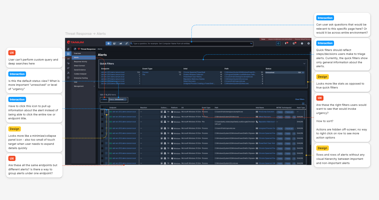
Information overload. The page rendered thousands of alert rows with little visual hierarchy, forcing analysts to scroll endlessly through undifferentiated data to find what mattered.
Hidden critical data. Critical columns — Intel names, MITRE technique mappings, file paths, and action buttons — were cut off or hidden due to table overflow, meaning users had to scroll horizontally to access basic actions.
Underutilized Quick Filters. Although Quick Filters were valued by users as a way to surface 'big problems,' they surfaced raw counts in a plain table format, missing an opportunity for true visual scanning.
Slow time-to-action. Starting an investigation, connecting to an endpoint, or dismissing an alert required multiple clicks through menus that weren't immediately visible on load.
The Business Challenge
Tanium's legacy design system needed a visual facelift — the Alerts page used an older style that the team was actively moving away from. This redesign needed to simultaneously solve the UX problems AND demonstrate what a modernized Tanium interface could look like. The stakes were high: in cybersecurity, every second of analyst confusion is a second a threat goes uncontained.
Research & Discovery
Given this was a design exercise with limited access to live users, I grounded my research in a combination of domain analysis, heuristic evaluation, and threat modeling frameworks to ensure design decisions were rooted in real analyst behavior and security industry standards.
Methods
Heuristic Evaluation. Conducted a thorough heuristic evaluation of the existing Alerts page against Nielsen's 10 usability principles. Key violations identified: lack of visibility of system status, poor error prevention in bulk actions, and no recognition over recall support.
Domain Research. Studied the Cyber Kill Chain and MITRE ATT&CK framework to understand how security analysts mentally model threats — not as individual rows, but as attack patterns and chains of activity. This directly shaped how I thought about grouping and surfacing alert data.
Competitive Analysis. Benchmarked adjacent enterprise security tools to understand established patterns for alert triage dashboards, including how they handle severity hierarchies, status workflows, and quick action affordances.
Persona Development. Mapped user personas based on the brief: primary user is a security analyst who needs fast triage (speed, accuracy, confidence); secondary user is a security manager who needs high-level scope awareness before drilling down.
Before: The existing Alerts page — data-dense table with no visual hierarchy, truncated columns, and buried actions.
Design Strategy
With the research grounded, I defined three core design principles to guide every decision:
1. Scope first, detail second. The page should answer 'what's happening at scale' before asking users to engage with individual rows.
2. Action proximity. The most frequent analyst actions (investigate, connect, dismiss) must be reachable in one click from the list view — no buried menus.
3. Signal over noise. Every column shown must earn its place. MITRE tags, Intel names, and status indicators get visual weight; less critical metadata is deprioritized or hidden behind progressive disclosure.
Information Architecture
I restructured the page into three clear zones:
Zone 1: Summary Layer (Alert Charts). A customizable dashboard header surfaces four high-level alert charts at a glance — giving analysts an immediate visual read on threat volume and distribution before engaging with individual alerts. The Customize control lets users tailor which metrics appear based on their role and priorities.
Zone 2: Scope Layer (Filter Tabs). Below the summary, a filter tab bar with item count ("Showing # of # items") acts as the triage entry point — letting analysts narrow the full alert dataset by filter type before touching the table. This preserves the Quick Filter concept from the original while giving it cleaner structural separation from the data below.
Zone 3: Action Layer (Alert Table). The table itself becomes a focused action surface — each row scoped by the filters above, with expandable rows, status indicators, and inline action controls (Action type + overflow menu) available without leaving the list.
User Flows Mapped
Primary flow: Land on page → read summary charts for scope → apply filter tab to narrow by type → scan table rows → expand a row or trigger inline action → initiate investigation or set status
Secondary flow: Receive alert notification → land directly on filtered table view → review row detail → use Action type shortcut to connect to endpoint or begin remediation
Lofi Mockup - Showing three separate zones (Summary layer, Alerts layer, Actions layer)
Understanding the MITRE ATT&CK tactics informed how alert data should be contextualized — not just listed.
Key Findings
Analysts' primary question on page load is: 'What is generating the most alerts, and is it a real threat?' — not 'Show me all alerts in chronological order.'
The Quick Filters feature was the most valued element of the existing page because it provided that scope-at-a-glance view. Any redesign needed to preserve and elevate this pattern.
Security analysts are highly keyboard- and shortcut-oriented. Hover states, right-click menus, and inline action affordances are critical for speed — full-page navigations for single actions are a hard stop.
MITRE technique tags carry significant semantic weight for experienced analysts. Surfacing these inline (rather than in a detail panel) helps users quickly assess severity without leaving the list.
Personas - outlines the profiles of three security professionals and their respective roles, needs, and challenges.
Design Process
Moving into high-fidelity design, I worked within Tanium's established product shell while introducing a modernized visual language — driven by four goals:
Understand the threat landscape at a glance — a summary layer of alert charts replaces the cold open into a wall of rows.
Shorten time-to-action — inline controls on every row eliminate the right-click and detail-view detours.
Reduce cognitive load — three distinct zones (summary, filter, action) keep analysts oriented throughout triage.
Modernize for clarity — updated typography, column structure, and status indicators cut visual noise without sacrificing density.
Summary layer: MITRE-aware data visualization. Rather than generic alert counts, the four summary charts surface what actually matters to a security analyst — MITRE ATT&CK tactics broken down by severity (Critical, High, Medium, Low) and a technique hotspot chart showing which techniques are hitting the most endpoints. An analyst can read the threat shape of their environment in seconds, before touching a single filter.
Filter layer: status-driven scoping. Six status-based filter tabs replace the legacy Quick Filters table — letting analysts narrow the full alert dataset to the state they care about (unresolved, in-progress, complete, failed) in one click. A persistent active filter indicator and real-time item count ("Showing X of X items") confirm scope at a glance, eliminating the uncertainty of whether a filter is actually applied.
Table layer: context-rich rows, zero extra clicks. Every row carries the information an analyst needs to make a triage decision without opening a panel: endpoint name with expandable detail, a color-coded status chip, event type, intel name, inline MITRE technique pills, and timestamp. Two persistent action links plus an overflow menu sit at the row's trailing edge — investigation and endpoint connection are always one click away.
Column architecture. The table headers are sortable and selectable, giving analysts control over how they cut the data — by technique, by status, by time — without leaving the list view. Bulk selection via checkbox supports multi-alert workflows.
Reflection & Learnings
Metrics of Success
While this was a design exercise without live user testing, I defined success criteria based on the brief's stated goals:
Quick threat scope visibility: Analysts can identify the top 3 alert sources within 5 seconds of page load, without scrolling — achieved through the redesigned Quick Filters intelligence panel.
Action reachability: Primary actions accessible in 1 click from the list view (down from 2–3 clicks in legacy) via the inline hover action bar.
Information density without overwhelm: MITRE technique tags and status chips give trained analysts more signal per row, while progressive disclosure keeps the view clean for newer users.
Facelift fidelity: The visual language update was executed within the existing product shell, demonstrating an understanding of how to modernize incrementally — without a full design system overhaul.
What I Learned
Domain depth accelerates design decisions. Taking time to genuinely understand the MITRE ATT&CK framework wasn't academic — it directly shaped which data fields earned visual priority in the table.
In enterprise security UX, speed and trust are the primary design currencies. Every interaction pattern I chose was filtered through 'does this make an analyst faster, and does it make them feel confident in what they're seeing?'
Design systems constraints are creative constraints. Working within Tanium's existing product shell forced me to find impact through typography, color, and information architecture — not through layout reinvention.
If I Had More Time
Conduct moderated usability testing with security analysts on the redesigned prototype — specifically measuring time-to-first-action and error rate in the triage workflow.
Explore a 'threat cluster' visualization layer above the table — grouping related alerts by attack pattern (Kill Chain stage) rather than showing each alert as an independent row.
Build out the mobile/responsive state for SOC analysts monitoring alerts on secondary screens or during incident response on the go.