Converge
Context
This project was initiated by the Marketing Events team, who had recently migrated to a new CMS platform and required a dedicated digital experience to support clear communication, seamless attendee flows, and strong brand alignment.
The Converge event site was designed under tight time constraints — two month from kickoff to launch — for a global enterprise audience.
Role
Lead Designer
Collaboration
Events Team
Areas
Strategy, Branding, Design
Tools
XD, Swoogo
Year
2023
Original Converge design from 2022
Final event website launched for Converge 2023
Objectives
Design and deliver a cohesive enterprise event website with:
Intuitive information architecture tailored to complex user needs (prospects, customers, partners)
Clear interaction flows for discovery and registration
Consistent visual and brand language aligned with corporate identity
UX Strategy
Due to time constraints, I prioritized my time thinking through the information architecture, UX flow and navigation, and sticking to brand & visual consistency.
Information Architecture
A well thought-out information architecture reduces cognitive loads for users so to accommodate for diverse audience segments and support complex user journeys without friction,
I spent time:
Formulating an IA structure that balances corporate content needs and user expectations
Ensuring content was bucketed under clear hierarchies to be discoverable for both first-time visitors and returning customers
Proposed categorization and navigation
(scroll within the embedded frame to view)
Final navigation breakdown
(scroll within the embedded frame to view)
Interaction & Design Process
With the information architecture established, I shifted focus to visual design. Leveraging existing corporate website components, I designed the event pages to feel cohesive with Tanium’s brand while still providing a distinct event identity.
Designed interaction patterns for:
Global navigation
Multi-level page hierarchies (L1-L3)
Registration pathways with annotations for key touchpoints
Annotations for converge website navigation
(scroll within the embedded frame to view)
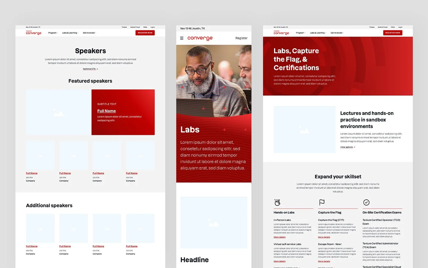
Finalized L2 - L3 Pages
Final designs of event registration experience and path
(scroll within the embedded frame to view)
Outcome & Impact
Positive feedback & adoption
Although quantitative metrics were not captured, the new Converge website received highly positive feedback from customers, partners, and internal teams. Attendees described the site as easy to navigate, visually appealing, and a significant improvement over the previous year.
Real-time UX validation
In addition, because of the accelerated schedule, I conducted live analysis during the Converge event, observing the user experience in real time and noting opportunities for future improvements. This not only provided actionable insights but also reinforces the value of continuous iteration, even in fast-paced projects.
Goal during observations:
Understand real user behavior
Identify interaction pain points
Capture opportunities for measurable improvements in future releases
UX analysis of Converge 2023
(scroll within the embedded frame to view)
Reflection & Learnings
Given the fast turnaround, I collaborated closely with the Events team, relying on their insights and soft data about customer behavior and expectations. As subject matter experts, they provided valuable input throughout the design process, and I made it a priority to ask targeted questions to ensure the design aligned with both user needs and business goals.
With additional time, I would focus on refining the experience further—particularly by incorporating best practices into the registration flow, virtual event journey, and confirmation process to create a more seamless and user-centered experience.
Future enhancements
Refine interaction design for:
Event registration flows
Virtual event journeys
Confirmation and follow-up experiences
Accessibility optimizations