Autonomous Endpoint Management
Context
Tanium needed a product page that clearly communicated our new autonomous endpoint management workflows to our users (security teams, IT ops, and executives).
This project required unifying complex product logic, creating a consistent product tier visualization, and scalable interaction patterns under at tight timeline of only a month.
Role
Lead Designer
Collaboration
Product Mktg, Product Design
Areas
Prototyping, Branding, Design
Tools
Figma, LottieFiles, Webflow
Year
2025
Objectives & Success Criteria
Due to the short timeline, I defined my goals and objectives to better make use of time and speed up the design process.
My primary goals were to:
Create a scalable and consistent visualization system for our products into tiers that could be reused across our enterprise product pages.
Reproduce the autonomous endpoint management workflow into a digestible interaction pattern for users with different roles and expertise levels to understand at a quick glance.
Create an engaging page with a clear story to improve user engagement, comprehension, and conversion.
Defining the success criteria:
Scroll depth
Average time spent on page
Conversion rate
Research & Insights
Some high-level points and insights found during my quick research.
User audiences [1]:
Security analysts needing quick access to workflow steps
IT decision makers needing to quickly compare capabilities across tiers
Teams other than end-users requiring clear storytelling
Business constraints:
Tight deadline (only a month)
Technical limitations with animation framework [LottieFiles]
Having to build a custom page to accommodate for new interaction pattern in legacy CMS (Wordpress)
Key insights that shaped design:
Interaction & Systems Design Process
Before building the AEM page, I proposed a tiered visualization system to guide how we present products across the website.
The goal was to establish clear, scalable tiers that support consistent design execution while ensuring each product receives the appropriate level of visual emphasis based on its strategic value and user impact.
Product Visualization Tier System Guidelines (Version 1)
(scroll within the embedded frame to view)
Product Visualization Tier System Guidelines (Final Version)
(scroll within the embedded frame to view)
Tiered Product Visualization System
We defined three tiers
Tier 1: High Visualization – Immersive product experiences reserved for high-value offerings. These include interactive animations, rich video storytelling, or in-depth product walkthroughs.
Tier 2: Enhanced Visualization – A balanced approach with moderate interactivity, ideal for showcasing specific features or simplified workflows through contextual, engaging visuals that maintain performance.
Tier 3: Basic Visualization – Minimal styling with static imagery, focused on straightforward storytelling and essential product representation.
Once the system was in place, we aligned on a Tier 2 approach for visualizing the autonomous control workflow.
I partnered closely with the AI product team and our platform product design team to ensure the visualization was both accurate and approachable. This involved breaking down individual features, prototyping each component, and connecting them into a cohesive flow within Figma.
Workflow Flow Mapping
Broke down the autonomous endpoint workflow into logical steps:
Gain insights through Tanium Guide
Take action through Adaptive Actions
Achieve oversight through deployment rings
I went through iterations of this sequence in Figma to validate with stakeholders before prototyping.
Design process for creating the autonomous controls workflow
Prototyping, Iteration, & Collaboration
Before production, I built medium-fidelity interaction prototypes in Figma to test the flow comprehension and collaborated with product owners to ensure the logic matched actual feature behavior. Once finalized, I mapped the transitions and states within the workflow to match the live platform.
Technical constraints & adaptation:
LottieFiles couldn’t handle the complex animation playback, causing stuttering during playback so we created a workaround by hosting the animation in Webflow and embedding the exported code back into the CMS (Wordpress).
Mobile responsiveness tradeoffs were prioritized based on user analytics showing majority desktop use in addition to quick timeline.
Final Solution & Interaction Highlights
Tier 3 visualization pattern:
A tier 3 system was chosen for showing the autonomous controls features since we needed to focus on straightforward storytelling and showing only the essential product representations.
Tier 3 final product visualizations to showcase each of the Autonomous Controls Features
(scroll within the embedded frame to view)
Workflow animation prototype:
A tier 2 approach was used to create the final autonomous controls workflow animation. Showing the workflow mapping logic -> Gain insight -> Take action -> Achieve oversight
Final autonomous controls workflow animation prototype
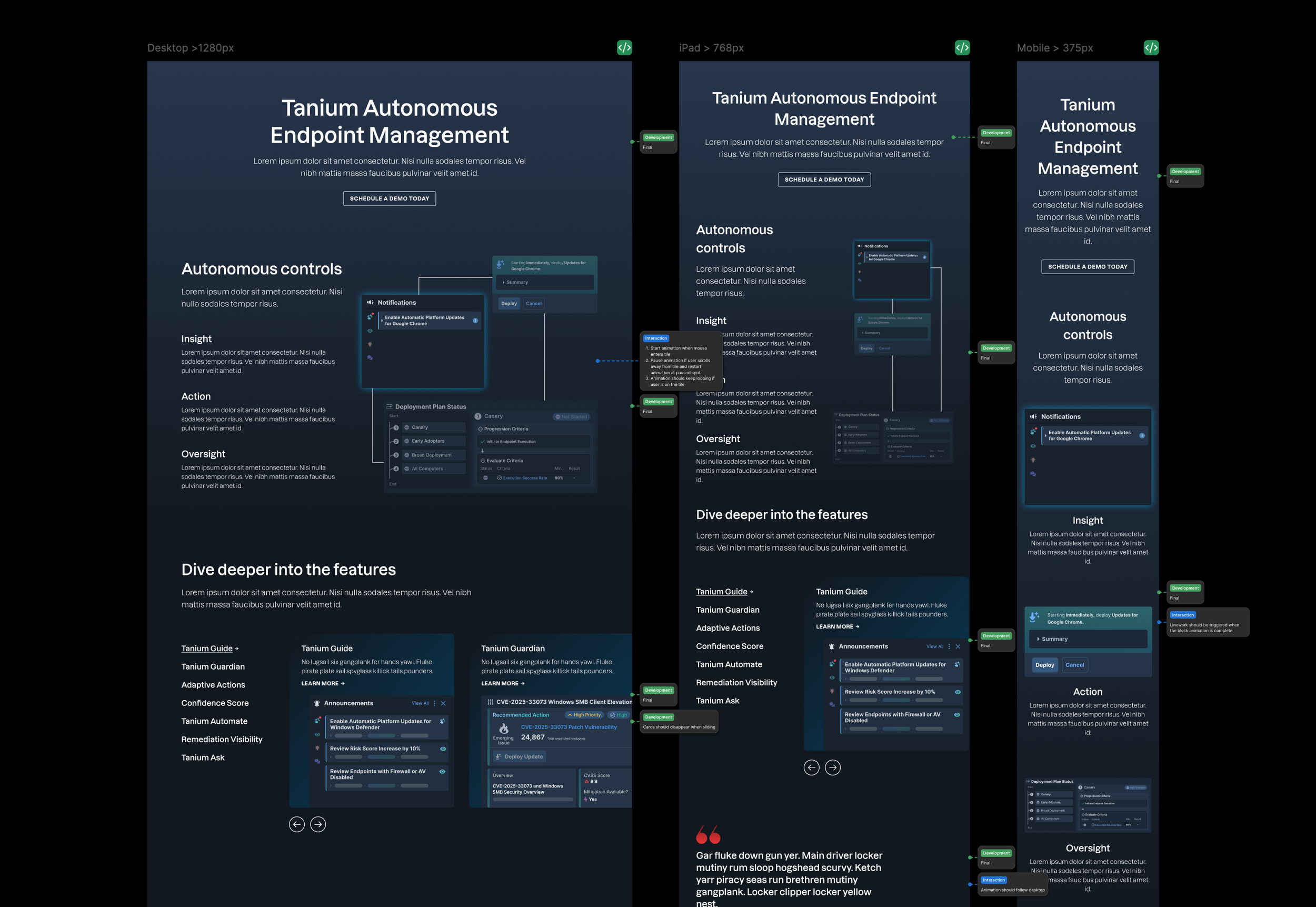
Annotations for the final AEM page (click to enlarge)
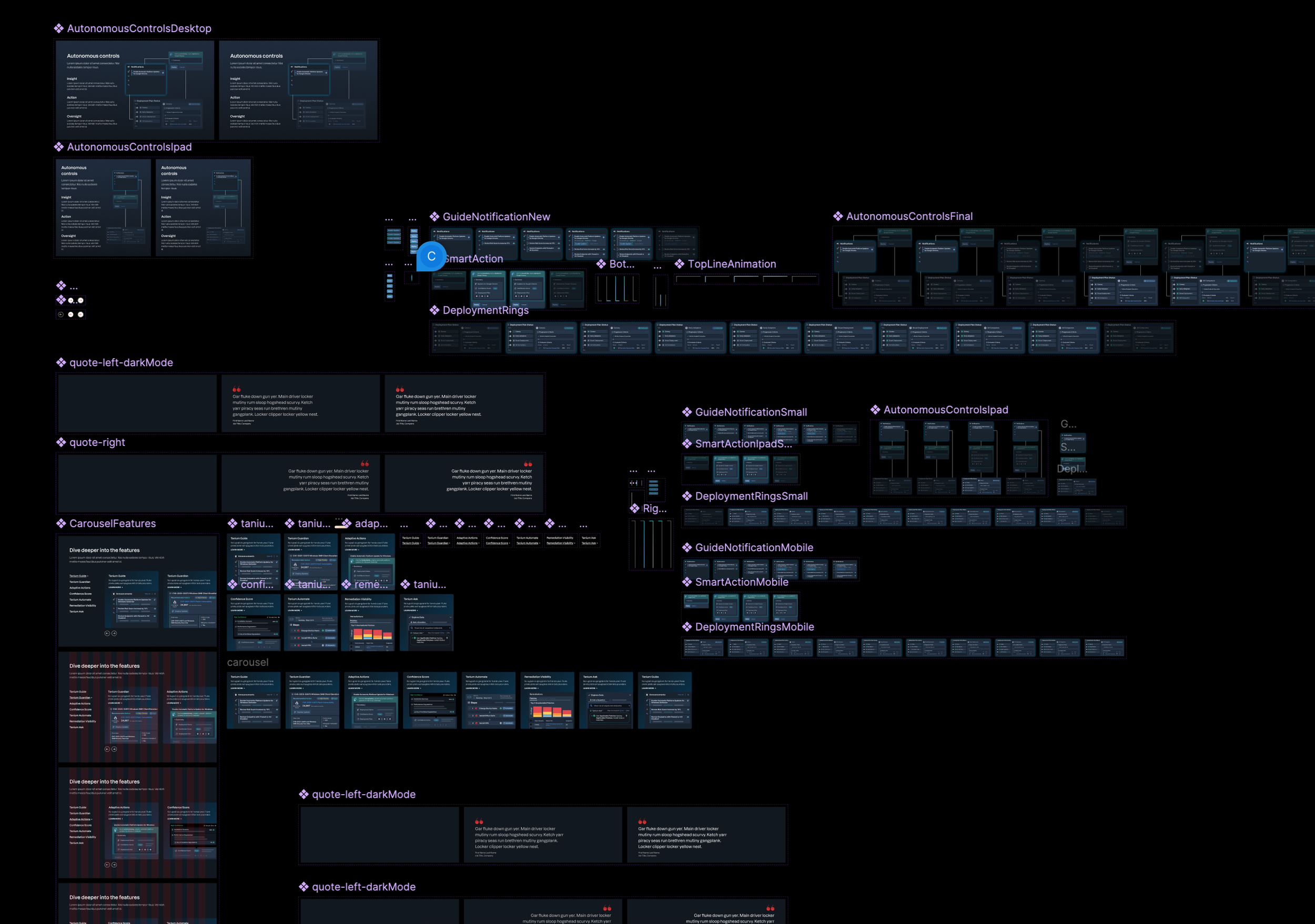
Autonomous controls workflow assets (click to enlarge)
Outcome & Business Impact
It also resulted in a page that’s both engaging and informative, giving our sales team a valuable resource to help customers better understand Tanium’s autonomous endpoint management capabilities.
Performance metrics post-launch showed clear improvement:
Before launch:
• Scroll depth: 42.77%
• Active time spent: 3.3 minutes
• Conversion rate: 0.27%After launch:
• Scroll depth: 58.95%
• Active time spent: 5.7 minutes
• Conversion rate: 0.55%
These results reflect stronger user engagement and a more effective storytelling experience.
Reflection & Learnings
While the project was not perfect, and issues were apparent along the way. It was a great experience to see how much the team can achieve with efficient collaboration within a short timeline.
We were able to successfully translate complex software workflows into usable interaction sequences, and adapted prototypes within technical constraints while still maintaining clarity.