Site Navigation & Footer
Context
This initiative began as part of a company-wide rebrand but has since evolved into an ongoing effort to continuously optimize and maintain the website’s navigation.
The goal has been to ensure an intuitive user experience that adapts each year to product updates, evolving messaging, and brand shifts.
Role
Lead Designer
Areas
Information Architecture, Navigation Systems, Brand, Design
Tools
XD, Google Analytics
Year
2024
Objectives & Success Criteria
As product offerings expanded, navigation complexity increased. My goal was for the redesign of both the navigation and footer was to support multiple product categories, documentation types, and user personas across an enterprise ecosystem.
Redesign the global navigation and footer to:
Improve content discoverability
Clarify product hierarchy
Reduce decision friction
Create scalable IA foundations for future growth
Success meant users could:
Understand the ecosystem at a glance
Reach key workflows in fewer clicks
Navigate confidently without relying on search
Access support, documentation and legal resources easily
Research & Insights
I started by reviewing established UI/UX guidelines for navigation and footers, with particular focus on mega menu heuristics. From this, I created a structured checklist to evaluate both competitor websites and our own, ensuring a consistent and thorough analysis.
Design Process
Heuristics checklist for Mega Menu
(scroll within the embedded frame to view)
Google Analytics done in 2021
(scroll within the embedded frame to view)
With the information and data that I’ve gathered during my research, I created multiple variations of designs and presented them to the web team and stakeholders to get feedback and finalize on an option.
Below are the annotations of the finalized designs for the different years and the process.
Additionally, analyzing data from Google Analytics and gathering feedback from stakeholders interviews, we were able to find the following:
Google Analytics (2021):
After homepage, Careers is the most visited page
Users who visit the Careers page, flowed through Resources, Events, and About Us after
This could suggest that a significant portion of visitors are prospects exploring job opportunities or preparing for interviews, not creating more obvious paths for users to explore Tanium’s platform offerings.
Footer best practices + design analysis
(scroll within the embedded frame to view)
Based on the research done in 2021 (additional research was done in 2022, but file got lost); we gained key insights into how our navigation and footer was performing based on heuristic level.
Mega menu:
Lacks navigation cues and depicts a flat navigation
Navigation can be access by ‘tab’ functions but lacks focus states resulting in low visibility of system status
Some “you are here’ mechanisms like page titles and URL changes but difficult to know where user is without sub navigation and/or breadcrumbs
Aesthetically is easily distinguishable and color contrasts are WCAG compliant
Too easily triggered by hover and entry/exit delay may be <0.5 seconds
Difficult to view all menu options on iPad and mobile
Footer:
Footer lacks structure and information hierarchy
Can’t tell what information is being prioritized
Huge, inefficient use of space
“Navigation is friendly, and the top menus are rolled up nicely.”
“Overall the website is easy to navigate. The dropdowns make sense and it’s generally easy to find content.”
“Super easy to use and navigate through, and with search function I can always find what I need.”
Mega menu design for 2022 created after research done in 2021
(scroll within the embedded frame to view)
Incorporated more navigation and contextual cues so users can have better informed decisions on what they are clicking and what kind of information will be on the page when they land.
Added ‘overview’ panels to create more visual emphasis on L1 pages and how they related to the L2 links within the same dropdown. Removed the utility nav which was mainly corporate information links since Tanium was trying to move away from establishing brand awareness and into brand consideration/equity.
Footer design for 2022 created after research done in 2021/2022
(scroll within the embedded frame to view)
Rearranged the links in the footer to act as the new area for users to find brand awareness links such as “About Tanium” and “Careers".
Organized the information hierarchy of the links in the footer to accommodate for users in different parts of their journey (Brand awareness, Early Stage, Middle Stage, and Late Stage prospects + customers/partners).
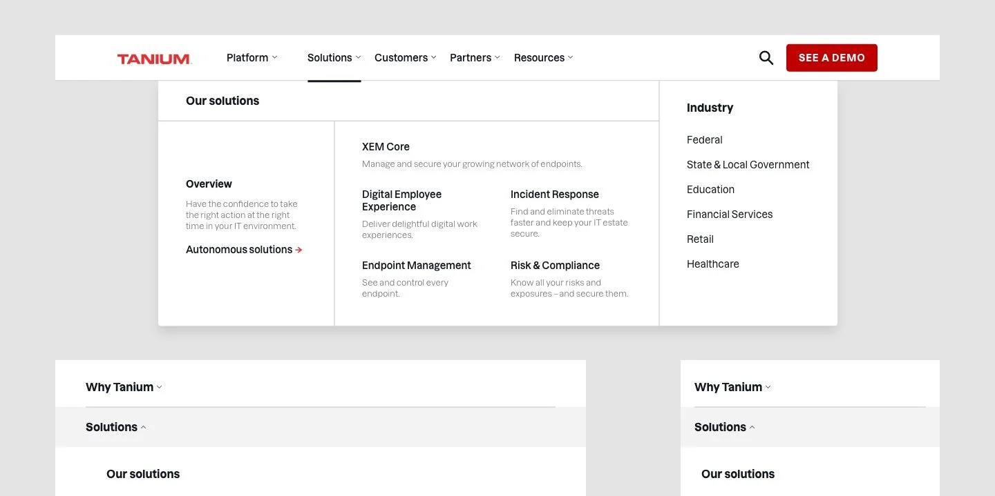
Final Solution
Out of the two options, the web team liked the ‘Grid’ option because they felt it allowed for more flexibility when the mega menu needs to be scaled for additional links and how it was easy to scan across the whole dropdown.
Iterations
The footer has mainly remained the same over the years following the same information structure due to good performance; however the mega menu was updated in 2023 to align with the new product message map and positioning, along with feedback we received from an internal website survey.
The following feedback we received:
The dark overview panels in the dropdown get missed during scanning
Hover states are distracting
No longer need “Platform” since we’re becoming “Solutions” focused and to lead with “Why Tanium?” as the first navigation link to describe the Tanium platform
Final mega menu annotations 2023
(scroll within the embedded frame to view)
Finalized utility navigation design for 2023
(scroll within the embedded frame to view)
2 options for mega menu created in 2023
(scroll within the embedded frame to view)
From 5 options (not pictured), our team picked the following two options above to narrow down on.
My main goal while designing for the new mega menu was to focus on:
Simplicity
Grouping information together in a subtle but distinct way
Not creating too much different visual contrasts between links to create an easier scanning experience
Although quantitative metrics were not captured, the new navigational experience was well-received by customers and internal Tanium employees.
Some feedback we received with the latest roll-out of the new navigation design during our internal website survey in 2024: